Now that we know enough about useState and state variables, let us pick up the pace now and build a Tabs component that shows different content based on the selected tab.
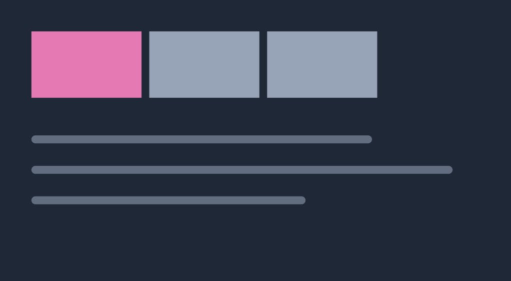
By the time we are done with this chapter, we will have built a nice Tabs component like this. And we will be able to toggle between "All Posts" and "Featured Posts".
*Note: This article is a part of the Delightful React Series, as part of which, I am releasing one chapter every day for 25 days. Please support me in anyway you can! *
Building a Tabs component
- Given a list of tab names and their tab contents, a tabs component should be able to display a tab content when it’s corresponding tab name is clicked.
It's a very common component and building components like these strengthens our React foundations.
Let's refactor our app first
Our home page is showing a list of all posts right now and it looks like this.
// pages/index.js
// ...

function Home(props) {
  return (
    <div>
      <Heading>All Posts</Heading>
      <div className="post-list">
        {BLOGPOSTS.map((blogPostObject) => {
          return (
            <div key={blogPostObject.title} className="post-list-item">
              <img src={blogPostObject.img} />
              <div>
                <h1>{blogPostObject.title}</h1>
              </div>
            </div>
          );
        })}
      </div>
    </div>
  );
}

export default Home;
**You can use this code sandbox embed as a starting point for this chapter. Fork it and follow the next instructions.
- We eventually want to show two tabs of posts.
- And both tabs show the posts in the same way, except, favourite posts will contain only the posts that a user has liked. So let's first create a reusable
ListItemcomponent that can show the fields of ablogPostObjectLet's create a file atsrc/components/ListItem.jsand put in the following content.
//src/components/ListItem.js
export default function ListItem(props) {
  const { blogPostObject } = props;
  // const blogPostObject = props.blogPostObject
  const { img, title, content = "", tags } = blogPostObject;
  return (
    <div className="post-list-item">
      <img src={img} />
      <div>
        <h1>{title}</h1>
        <p>{content.slice(0, 100)}</p>
        <div className="tags">
          {tags.map((tag) => (
            <span key={tag}>{tag}</span>
          ))}
        </div>
      </div>
    </div>
  );
}
Note: This isn't any thing new, we used the same UI in our previous chapters. We just moved all of it into it's own component so that we can reuse it.
- Now let's create a component called
AllPostsinside ourpages/index.jsfile to show all the posts.
//pages/index.js

import ListItem from '../src/components/ListItem'

  function AllPosts() {
    return (
      <div>
        <Heading>All Posts</Heading>
        <div className="post-list">
          {BLOGPOSTS.map((blogPostObject) => {
            return (
              <ListItem
                key={blogPostObject.title}
                blogPostObject={blogPostObject}
              />
            );
          })}
        </div>
      </div>
    );
  }
- We want one tab for
All Postsand another tab forFavorite Posts. By the end of the series, we want users tofavoritesome posts for them to read often and find them all in this section. For now we will start off with a list of hard codeids and use them as favourite posts. Let's create aFavoritePostscomponent in thepages/index.jsfile.
const FAVORITE_BLOGPOSTS = BLOGPOSTS.filter((blogPostObject) =>
  [1, 3, 4, 5].includes(blogPostObject.id)
);
function FavoritePosts() {
  return (
    <div>
      <Heading>Favorite Posts</Heading>
      <div className="post-list">
        {FAVORITE_BLOGPOSTS.map((blogPostObject) => {
           return (
            <ListItem
              key={blogPostObject.title}
              blogPostObject={blogPostObject}
            />
          );
        })}
      </div>
    </div>
  );
}
- We can now render them in our
Homecomponent like so
  function Home(props) {
    return (
        <AllPosts />
    );
  }
Of course, we only want to show either AllPosts or FavoritePosts at any given time. So for that, let's build our Tabs component.
Let’s get started
We have been building components in our
src/componentsfolder. So let's continue that tradition and create a new file for our Tabs component atsrc/components/Tabs.js. We will first build this component inpages/index.jsand when it is done we will move it tosrc/components. For now leavesrc/components/Tabs.jsempty.Our Tabs component needs to have a state variable to track which tab is currently selected. So let's create a state variable for that purpose.
//pages/index.js

// create the component here temporarily.
// we will move this to src/components shortly
function Tabs(){
  const [currentTabIndex, setCurrentTabIndex ] = useState(0);
  return <div>
    <div className="tabs">
    </div>
  </div>
}
- Let’s create a couple arrays of equal size,
tabNamesandtabContents. SotabNamesare the tabs that will be selectable and when the firsttabNameis selected, we show the firsttabContent. If the secondtabNameis selected we show the secondtabContentand so on.
//pages/index.js

const tabNames = ["All Posts", "Favorite Posts"]
const tabContents = [<AllPosts/>, <FavoritePosts/>];

function Tabs(props){
    ...
}
- Let’s use the
currentTabIndexstate variable andtabContents[currentTabIndex]to show the selected tab.
//pages/index.js

function Tabs(props){
  const [currentTabIndex, setCurrentTabIndex ] = useState(0);
  return <div>
      <div className="tabs">
      </div>
      {tabContents[currentTabIndex]}
  </div>
}
- We can now render this on our
Homepage. Of course it’s doesn’t do much yet since we aren’t showingtabNames.
//pages/index.js
function Home(props) {
    return (
        <Tabs />
    );
}
- Let’s fix that by showing the elements of
tabNamesusing the.mapmethod.
//pages/index.js
// ...

function Tabs(props){
  const [currentTabIndex, setCurrentTabIndex ] = useState(0);
  return <div>
      <div className="tabs">
        {tabNames.map((tabName) => {
          return <span
                className="tab"
                key={tabName}
              >
              {tabName}
            </span>
        })}
      </div>
      {tabContents[currentTabIndex]}
  </div>
}
- Finally let’s make our
tabNameselements clickable and make them modify the state variable using theonClickevent.
//pages/index.js

function Tabs(props){
  const [currentTabIndex, setCurrentTabIndex ] = useState(0);
  return <div>
      <div className="tabs">
        {tabNames.map((tabName, index) => {
          return <span
                className="tab"
                key={tabName}
                onClick={function(){
                  setCurrentTabIndex(index)
                }}
              >
              {tabName}
            </span>
        })}
      </div>
      {tabContents[currentTabIndex]}
    </div>
}
Awesome, now our Tabs component is able to toggle across the two tabs and show the corresponding tab content.
Wait a minute though
Is the Tabs component reusable? Well, we are using tabNames and tabContents as hardcoded values which means that this component will always show the same content no matter where it is used. Instead our Tabs component should be able to work with any tabNames andtabContents.
- Let’s pass
tabNamesandtabContentsas props.
//pages/index.js
function Home(props) {
    return (
        <Tabs
             tabNames={["All Posts", "FavoritePosts"]}
             tabContents={[<AllPosts/>, <FavoritePosts/>]}
             />
    );
}
- Finally, let’s use
tabNamesandtabContentsfrom props.
// pages/index.js

function Tabs(props) {
    const { tabNames, tabContents } = props;
    //...
}
Almost there!
Our Tabs component is completely reusable now and doesn't depend on AllPosts or FavoritePosts components anymore. It can now be moved to src/components/Tabs. Let's do that now.
//src/components/Tabs.js

import { useState } from "react";

function Tabs(props) {
  const { tabNames, tabContents } = props;
  const [currentTabIndex, setCurrentTabIndex] = useState(0);
  return (
    <div>
      <div className="tabs">
        {tabNames.map((tabName, index) => {
          const isSelected = index === currentTabIndex;
          return (
            <span
              className={isSelected ? "tab active" : "tab"}
              key={tabName}
              onClick={function () {
                setCurrentTabIndex(index);
              }}
            >
              {tabName}
            </span>
          );
        })}
      </div>
      {tabContents[currentTabIndex]}
    </div>
  );
}

export default Tabs;
Active tab
It would be nice if we are able to highlight the selected tab.
I already added some specific styling if an element has tab class and active class. So let’s add in some logic to add the active class if the currentTabIndex equals the index in the map function.
//src/components/Tabs.js


{tabNames.map((tabName, index) => {
    const isSelected = index === currentTabIndex
    return (
      <span
        className={isSelected ? "tab active" : "tab"}
        key={tabName}
        onClick={function () {
          setCurrentTabIndex(index);
        }}
      >
        {tabName}
      </span>
    );
})}

Awesome, we now have a fully functional tab component!
Plan your components well
We went for a quick and dirty approach to build this component, because this is one of the first times we built a big component in this series.
- However, you can plan out components much better if you can visualise what your component is trying to do.
- Components are just like functions remember? When we plan functions in our mind, we think of input, output and body of the function.
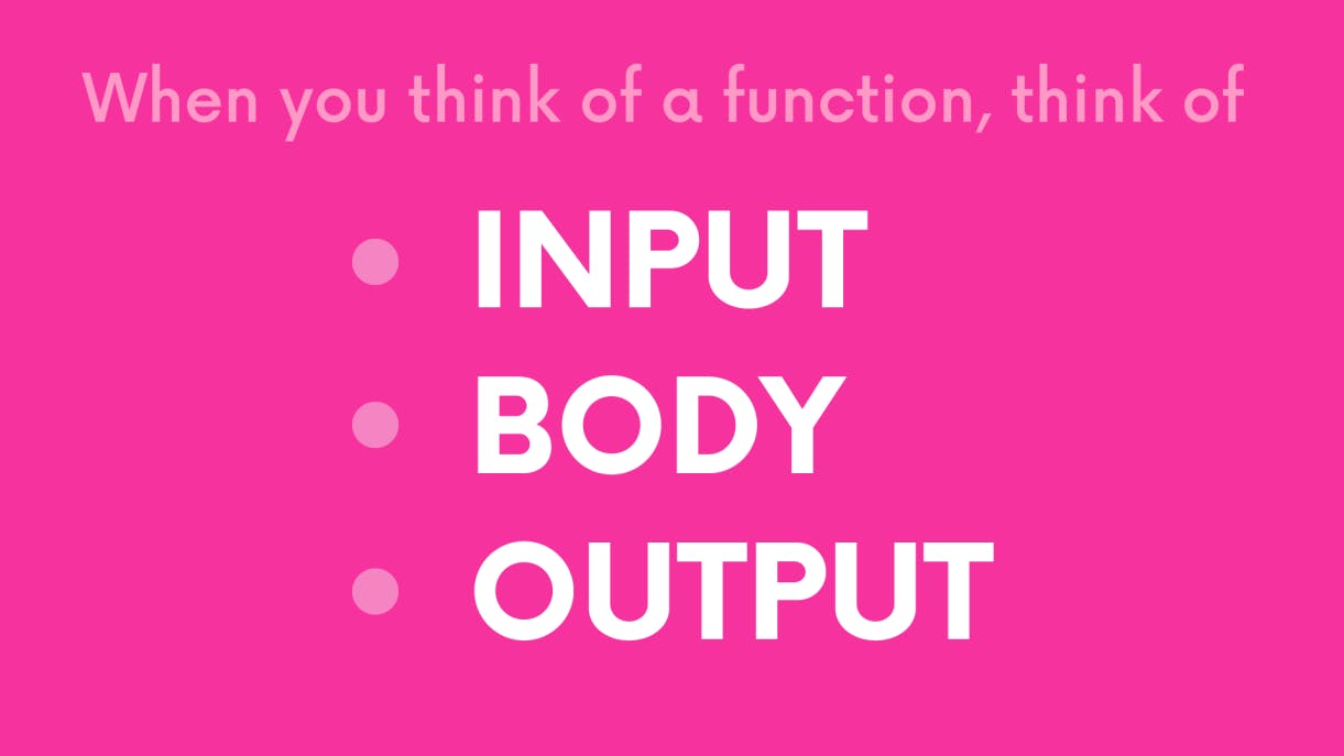
- Similarly, when building components we always need to consider
- what
propsour component should work with , - what
stateit should have and - what our component returns
- what
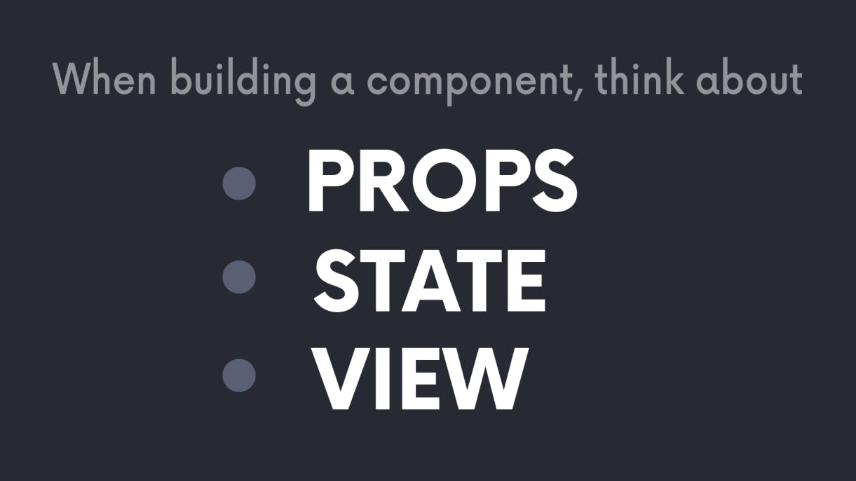
Once we understand that, we can plan the rest of the body around that.
- The Tabs component needs to receive which tabs to show as props.
- The Tabs component needs to track the current tab that is being show. So let’s create a state variable for that.
- The Tabs component will need to show all the
tabNamesand show the selectedtabName's content.
No matter which component we build in the future, we can ask ourselves these questions and plan our components well.
Great work so far!
Thanks for following me so far! We are beginning to some incredible components and hooks now. In the next chapter we will talk about Forms in React. Stay tuned!
Thanks and Please support my work
- Writing blog posts and making videos is an effort that takes many hours in my day. I do it because I love teaching and make great content.
- However, I need your support too. Please support my work and follow my social accounts to help me continue to make great content.
- Here are my social links.
Follow me on Twiter
Subscribe to my channel on Youtube
Thank you!
