We are at chapter 5. It's been a great journey so far. We learnt how to create React elements, how to use the JSX syntax, how to create components and how to use compose them together. But how do all these elements and components in our app talk to each other?
Passing around data in React
Just like DOM elements can be given attributes as additional information, React Elements, and components can be given Props.

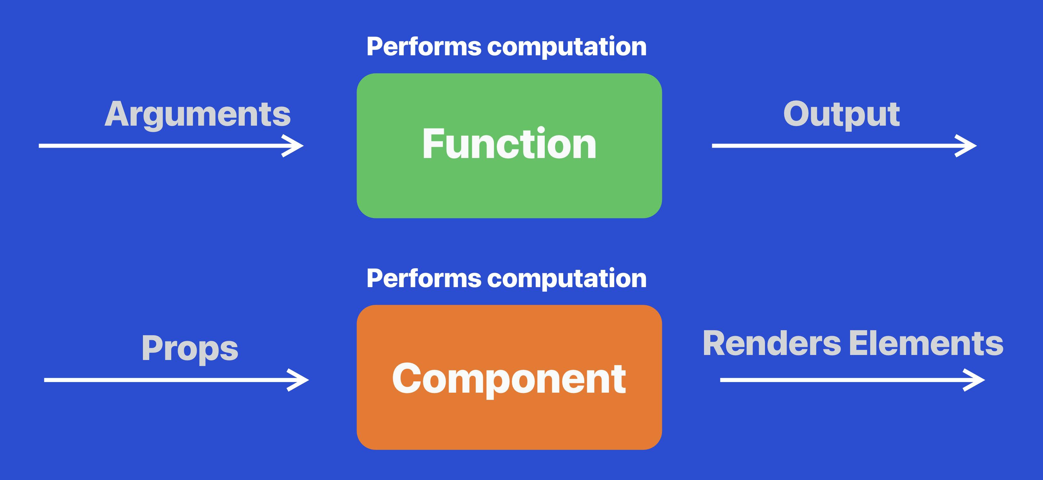
- One way to look at props is, if elements and components are functions, then props are like arguments to those functions.

Besides that analogy:
Props and attributes are interchangeable in meaning in React.
Props allow us to interact with our components and pass relevant information into them.
Props also allow components to interact with one another and share data around.
Props are a very important aspect of Composition.
Props with Elements
In fact, you might have already noticed, but in our components that we built so far, we have already used props.
We use an src prop on our image element to give a source to the image element.
export default function About(){
  return <div>
    <h1>About page</h1>
    <img src="https://assets.delightful-react.com/kindle.jpg"/>
    <p>Id ad in arcu ...</p>
    <p>Metus suscipit ...</p>
  </div>
}
The props passed to built-in elements in React are then used to create HTML attributes for the DOM elements that are eventually created.
- For eg: the 'src' prop given to an img React element will simply be used as the
srcHTML attribute for the img DOM node. - It works similarly for the
hrefprop on anchor elements - Most props for React elements behave exactly like the HTML attributes for their corresponding DOM elements.

However, there are some exceptions.
Style prop
Let us take a look at an important prop which all react elements have, which is the style prop. in HTML, the style attribute accepts a string of CSS rules in JSX, it is slightly different. In JSX, the style prop takes an object containing the properties in key value pairs.

So let's style our h1 element in our Home page and give it a color.
<h1 style={{
  color: "dodgerblue"
}}>
  Delightful React
</h1>
So this h1 element will be used quite a lot across our pages. And we want to make it as reusable as possible. Let's create a component out of it.
Let's keep our code organised
At this point, we are beginning to get into core React and we will be building a lot of components.
- Let’s create a folder called src in the root of our project folder right beside pages folder.
- The src folder will contain all of our Javascript modules except for the pages.
- Let’s create a folder called components inside it and put our Heading component inside it.
function Heading(props) {
    return <h1 style={{
        color: "dodgerblue"
    }}>Delightful React</h1>;
}

export default Heading
Our Heading component is now present at src/components/Heading.js. Let’s import that into our pages/index.js like so.
//pages/index.js
import Heading from '../src/components/Heading'

function Home(){
    return <div>
        <Heading/>
        <img
          src="https://assets.delightful-react.com/scenery.jpg"
        />
        <p>The best way to learn React!</p>
        <a href="https://google.com">Google</a>
        <br/>
        <button>Click Me!</button>
      </div>
  }

  export default Home;
Props with Components
Well, so we created a Heading component alright, but we are not able to customize it.
- It always shows "Delightful react".
And it always shows the same color.
To fix that, we will need to use props on our component. Lets give a text prop and a color prop and use that instead of hardcoded values.
Components are our own creation, so we can name our props however we want. At the same time, consuming them is also our own responsibility.
function Home(){
    return <div>
        <Heading
            text="Delightful React"
            color="pink"
         />
        <img
          src="https://assets.delightful-react.com/scenery.jpg"
        />
        <p>The best way to learn React!</p>
        <a href="https://google.com">Google</a>
        <br/>
        <button>Click Me!</button>
      </div>
 }
We can now access these prop values in our Heading component using the first argument of the Heading component function.
function Heading(props) {
    return <h1 style={{
        color: props.color
    }}>{props.text}</h1>;
}

export default Heading

That works! We managed to use props in our component. A nice touch can be that our Heading component can optionally take a color(we gave it pink in our home page). We can do so by simply putting in an || operator.
function Heading(props) {
    return <h1 style={{
        color: props.color || "dodgerblue"
    }}>{props.text}</h1>;
}

export default Heading
If we don’t give it any colour, it simply takes dodgerblue.
Children prop
There is actually a much easier way of passing our text as props into our component. When some content is put between the open and close tags of a React component, the component can access that content using a built-in prop called children. So instead of using the text prop, we can use the children prop to accept text.
<Heading>
    Delightful React
</Heading>
We can now access the text using props.children.
function Heading(props) {
    return <h1 style={{
        color: props.color || "dodgerblue"
    }}>{props.children}</h1>;
}

export default Heading
Project stylesheet
To make it easier for us to build our project, I went ahead and built a stylesheet that we can simply plug into our app and start using that instead of styling all of our elements from scratch.
- Styling is not the core emphasis of this book. So we'll simply use the styles that are present in the style sheet. The stylesheet that I made about is here. Now we need to embed this into our NextJS app. How do we do that?
How do we add a stylesheet to our NextJS app?
- When we were using our HTML project before, we could use a link tag and put it in our HTML page.
- But since NextJS doesn't expose the HTML page, how do we do it?
- Fortunately, NextJS has a component called Head, and we can use the Head component and put our style tags, scripts or link tags and they would be automatically added into the head section of the generated HTML page.
//pages/index.js
import Head from 'next/head'
import Heading from '../src/components/Heading'

function Home(){
    return <div>
        <Head>
            <link
                rel="stylesheet"
                href="https://assets.delightful-react.com/style.css"
            ></link>
        </Head>
        <Heading>
            Delightful React
        </Heading>
        <img
          src="https://assets.delightful-react.com/scenery.jpg"
        />
        <p>The best way to learn React!</p>
        <a href="https://google.com">Google</a>
        <br/>
        <button>Click Me!</button>
      </div>
  }

  export default Home;
Note: The Head component can be used anywhere inside the component’s JSX contents. Next.js will figure out how to extract the contents of the Head component and use it for the HTML head tag.
Take a look at our website now. It should look a lot different, and our style should have already been added to our web app.

Classname prop
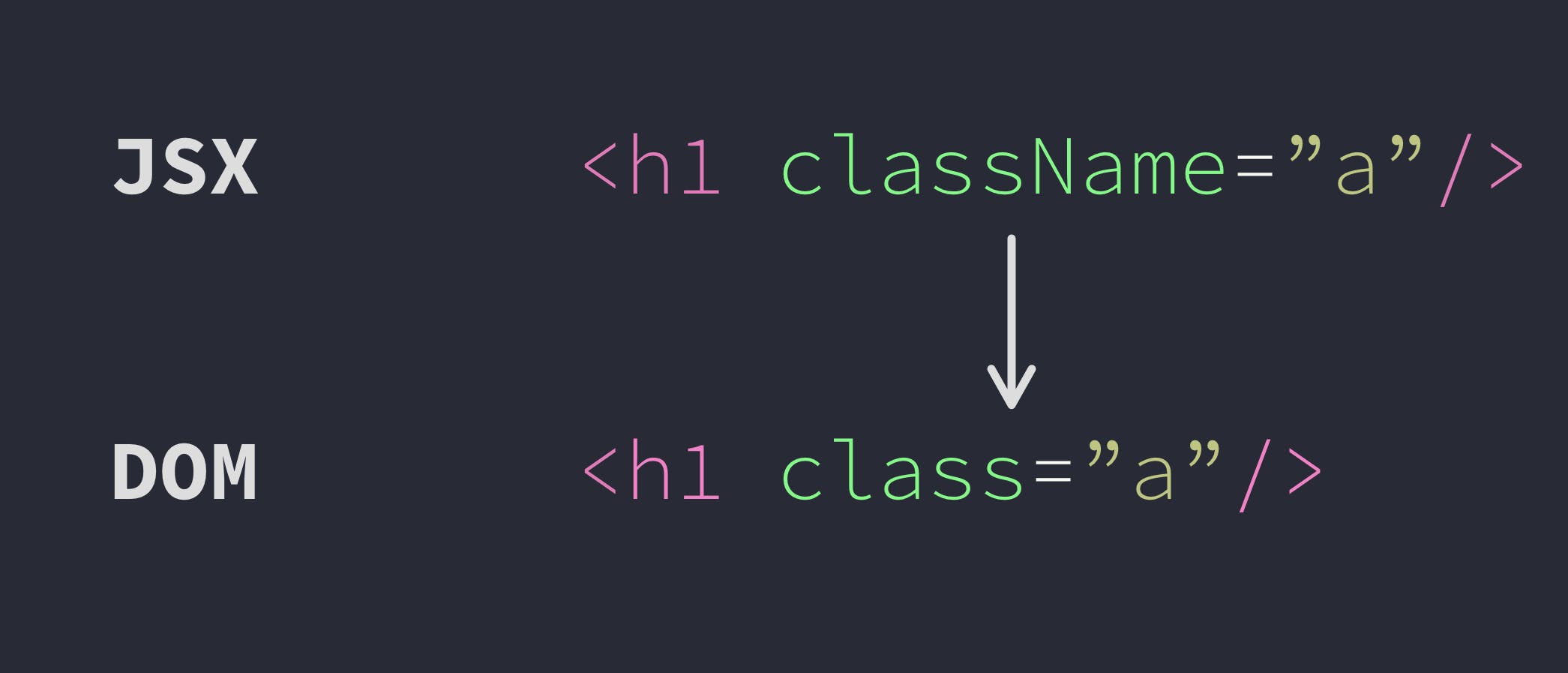
Awesome. So now that we added a CSS stylesheet to our web app, we can now use the classes in the stylesheet. To use a CSS class in HTML, we would use the attribute, class. But in JSX, the prop is called className. And it will be eventually converted to class when the HTML element is created out of the React Element.

- Note: This is called className and not class because class is a reserved keyword in javascript.
- So let's go ahead and add a few classes to our elements on the homepage.
- Let's give top padding of size four to our paragraph and the anchor tag below, and if you used TailwindCSS before, you probably know that this is given by using a pt-4 class.
- Don't worry if you don't know the class names; we aren't going to use too many of them, and you can always refer to them from Tailwind .
    <p className="pt-4">The best way to learn React!</p>
     <div className="pt-4">
         <a href="https://google.com">Google</a>
     </div>
Style and className are common props, which can be used on all React elements.
There are also other common props like event handlers which we'll discuss in the next chapter.
Data flow in React
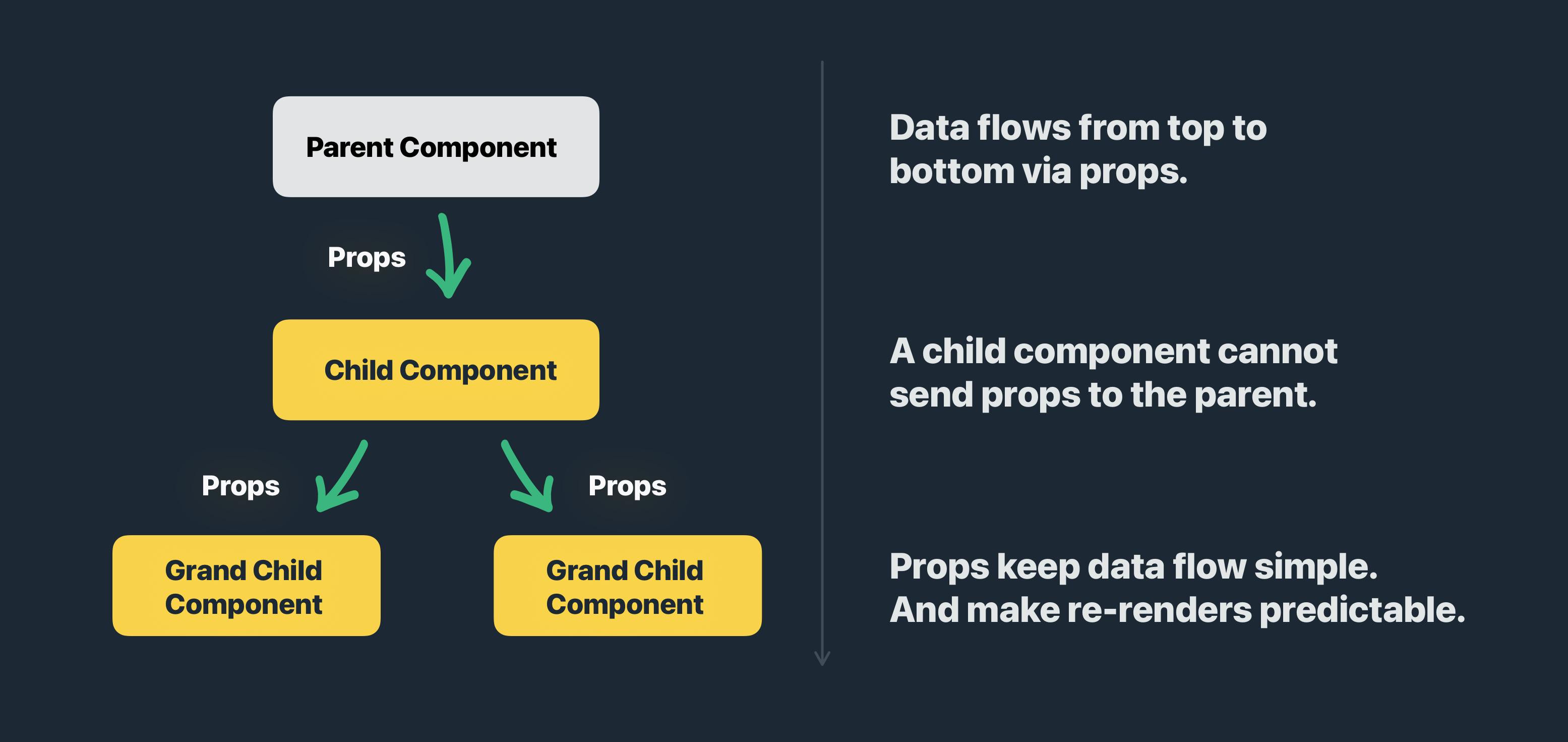
Since props for components are like arguments to a function, components receive props from outside (or from above in the JSX tree).

Data flows in react from top to bottom, and a parent component sends data to a child component, but not vice versa. This can go on and on.
Also, it is important to note that a parent component cannot directly send props to a grandchild component. Props can only be sent to immediate children of a component.
Great work so far!
Props are a fundamental aspect of React and understanding them is important for us to build components that are robust and reusable at the same time. See you in the next chapter!
Please support my work
Writing blog posts and making videos is an effort that takes many hours in my day. I do it because I love teaching and make great content. However, I need your support too. Please support my work and follow my social accounts to help me continue to make great content. Here are my social links.
Follow me on Twiter
Subscribe to my channel on Youtube
Thank you!
